
GRAND OAKS BBQ
Overview: Grand Oaks BBQ started as a request to design a label for a new BBQ seasoning, but it quickly became clear the product needed a stronger foundation. Instead of designing just a label, I helped shape the full look and feel of the brand, from naming and identity to packaging and supporting visuals. The goal was to create something that felt bold, local, and rooted in Texas, while still standing out on the shelf and connecting with everyday grillers.
Delivered: Market Research, Brand Identity, Packaging Design.
BRAND STRATEGY
What started as a packaging project turned into a bigger branding opportunity. The product needed more than a good-looking label. It needed a name, a story, and a clear point of view. Grand Oaks BBQ was built to feel grounded, strong, and tied to the local community, with a product that spoke to both serious BBQ fans and the backyard griller who just wants something really good on the meat.
My role was to turn that idea into a brand people could recognize and connect with. The direction needed to feel authentic, Texas-rooted, and confident without going overboard.
VISUAL IDENTITY
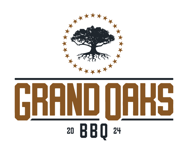
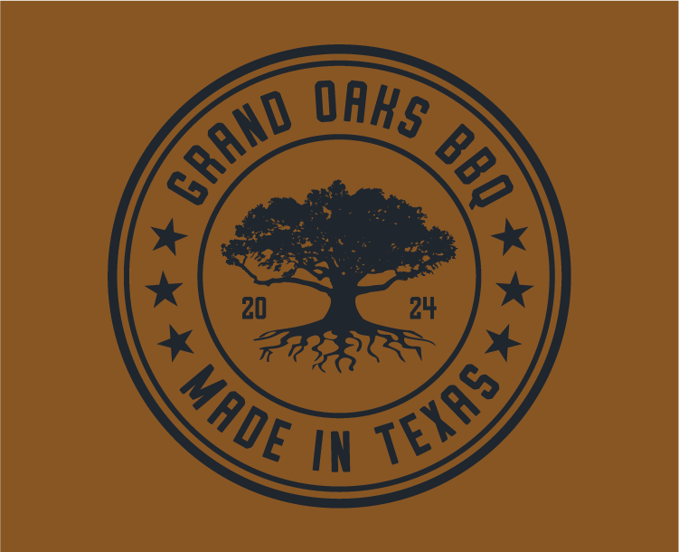
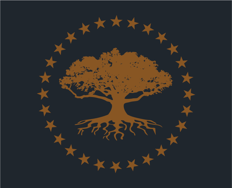
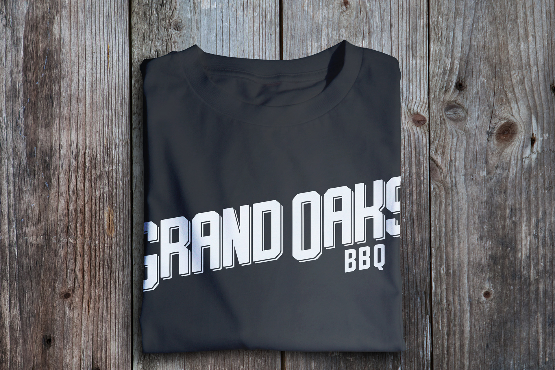
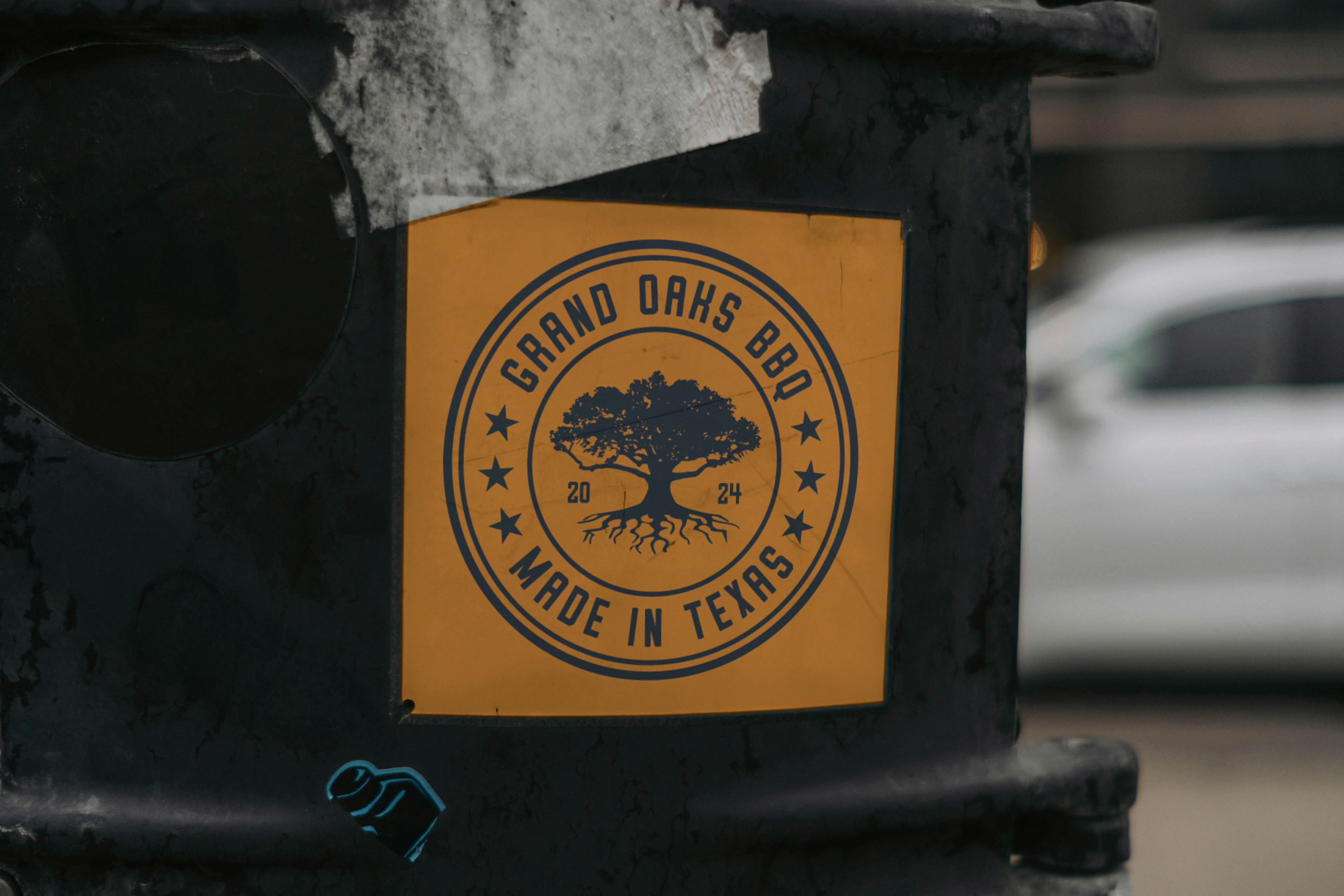
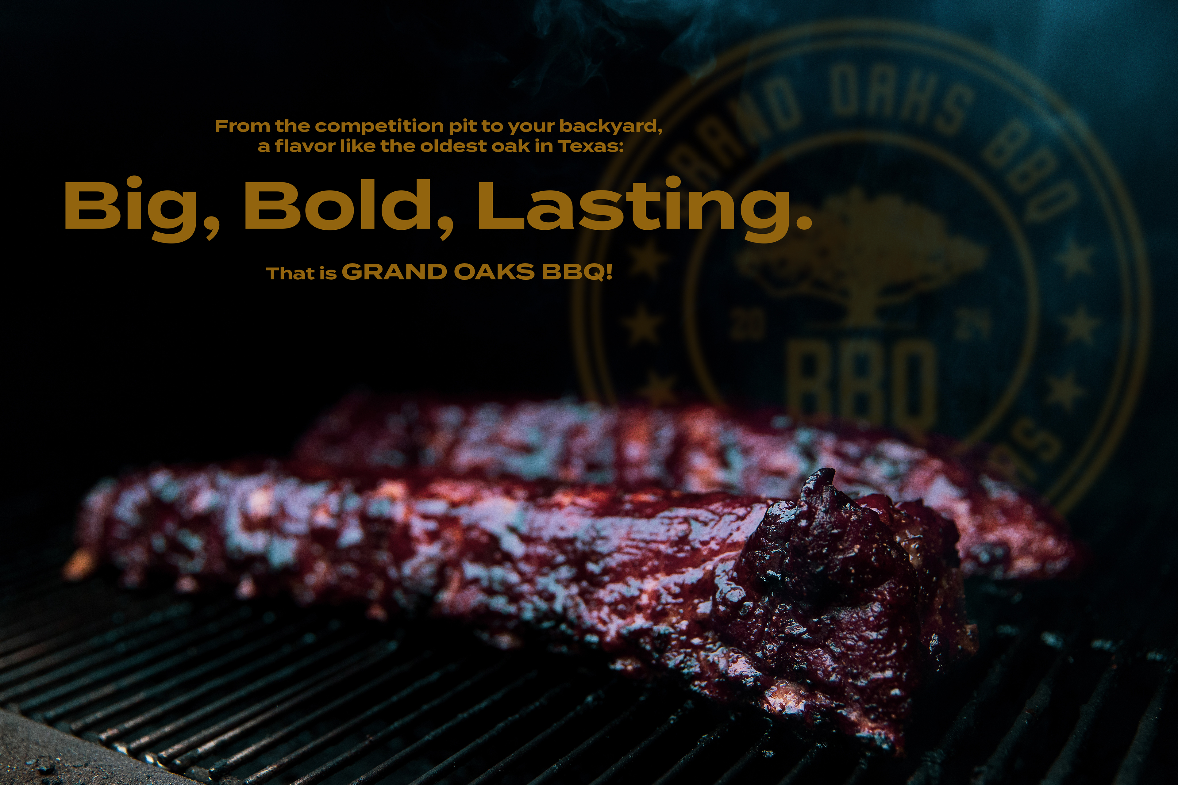
The visual identity was built around symbols that felt meaningful to both the founder and the region. The name Grand Oaks was chosen to reflect the local area and the strength and presence of the oak tree throughout Southeast Texas. The logo centered on a tree inspired by the oldest oak in Texas, giving the mark a sense of history, gathering, and toughness that matched the product well.
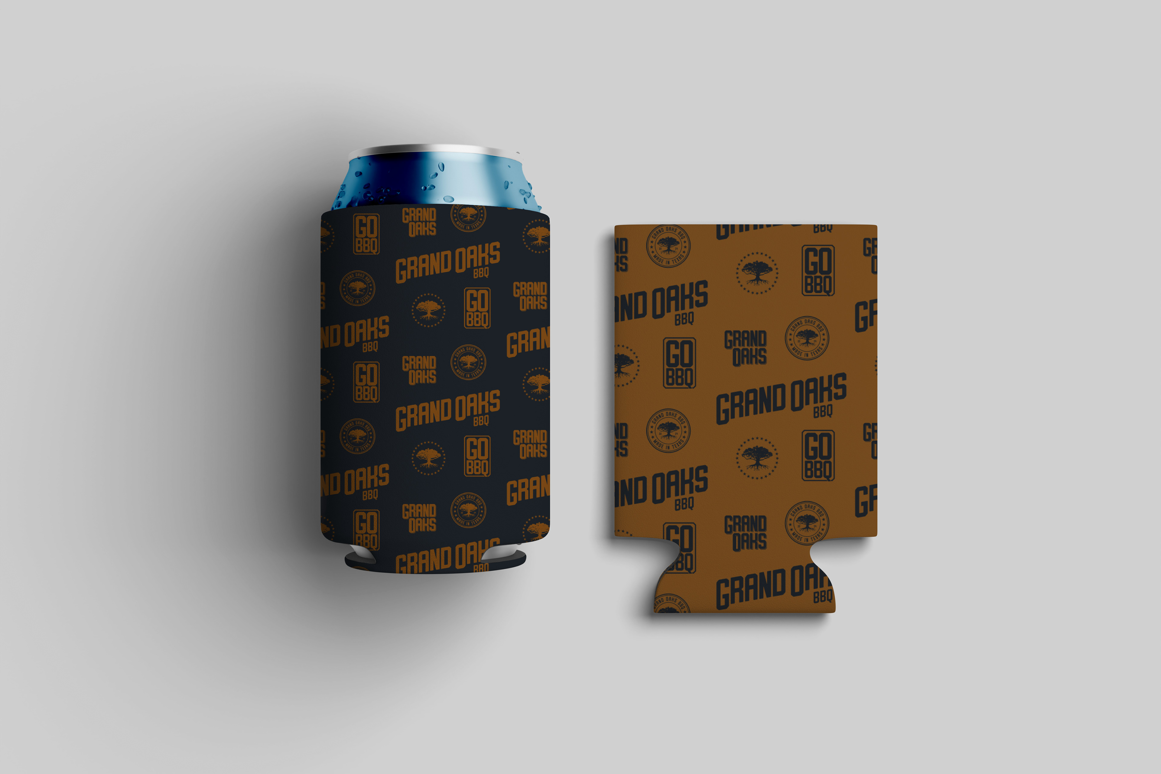
Details in the identity helped reinforce that story. The roots grounded the brand in Texas and community, while the stars added another layer of meaning; 28 stars on the logo represents Texas being the 28th state, and 6 stars on the badge for the 6 flags that have flown over Texas. Altogether, the system gave the brand a look that felt bold, meaningful, memorable, and grounded in place.
PACKAGING DESIGN
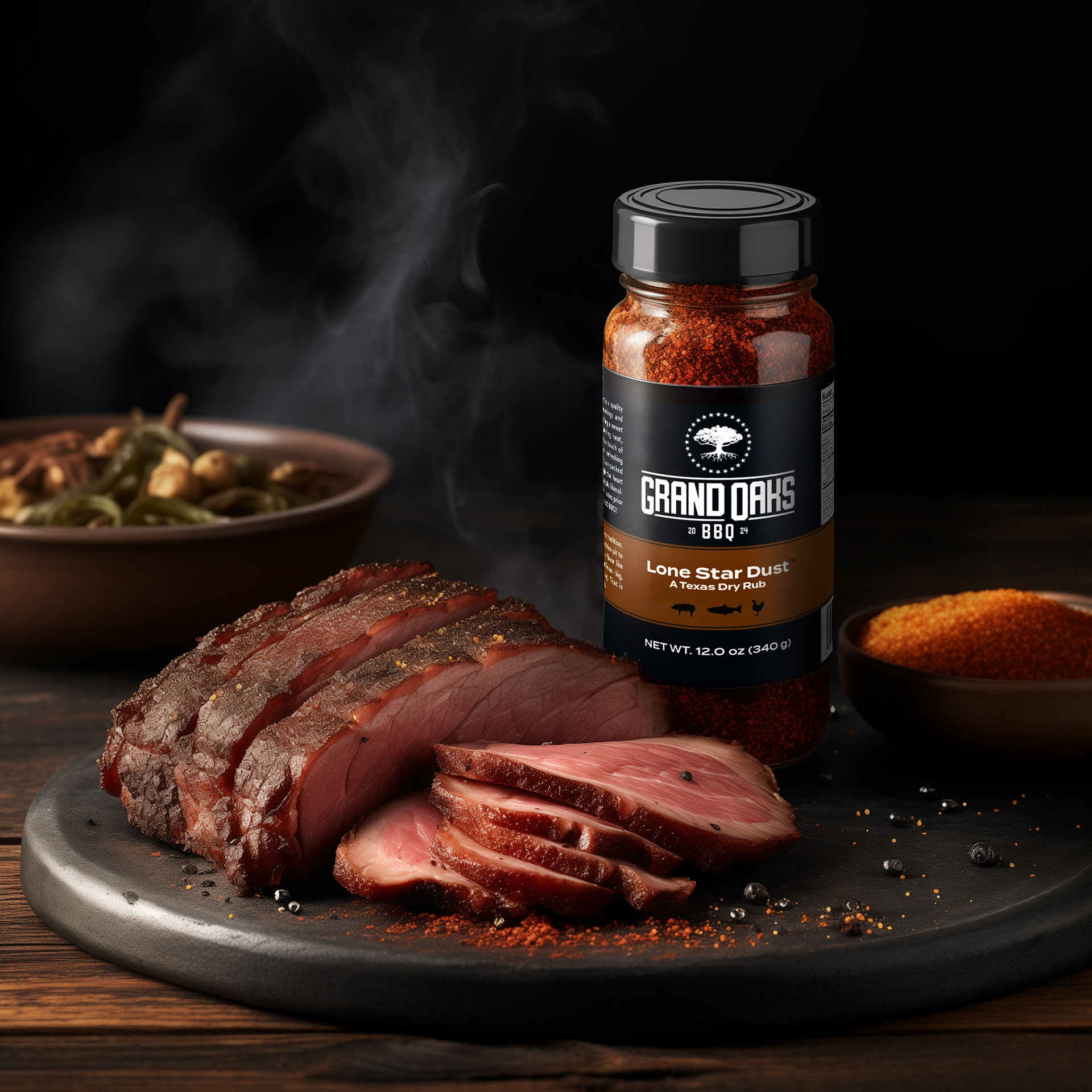
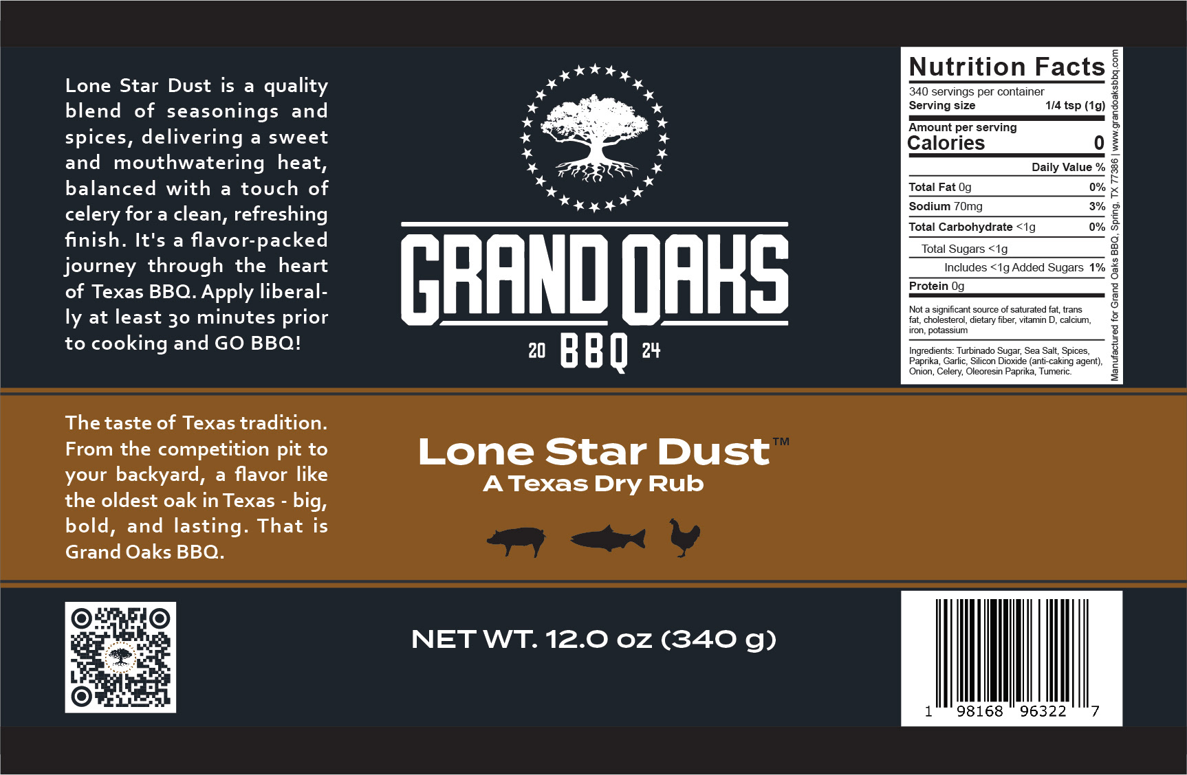
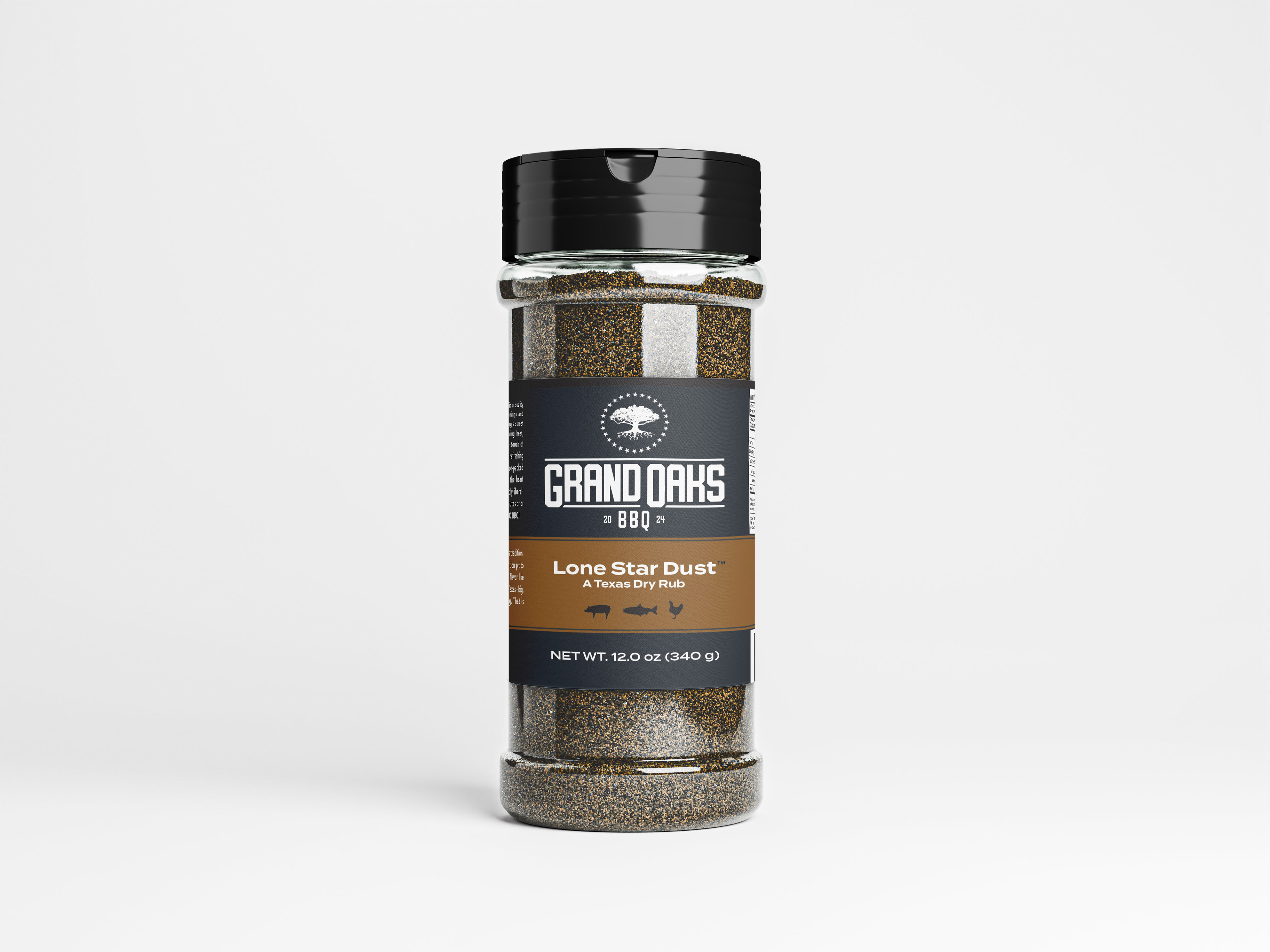
The packaging needed to do two jobs at once: catch attention on the shelf and feel true to the product inside. I designed the seasoning label to feel strong, clear, and easy to recognize, while carrying through the larger brand story. The goal was to create packaging that felt polished enough for retail, but still approachable to the kind of customer who values good BBQ without needing the flash.
In addition, the design allows for an easy pivot for additional products in the future by providing quick adjustment points while continuing to represent the brand.
OUTCOME
Grand Oaks BBQ launched with a much stronger identity than a label alone could have provided. The finished brand and packaging helped the product stand out both online and in stores, giving it a look that felt established from the start. Since launch, Lone Star Dust has made its way into specialty shops and homes well beyond Texas, helping set the stage for future seasonings under the Grand Oaks BBQ name. They now have 2 additional offerings bringing their product line to 3 seasonings in just under 2 years.
Grand Oaks BBQ | www.grandoaksbbq.com | Spring, TX
Brand Identity | Packaging Design | Copywriting
Let's Connect
Thank you!