

MD ANDERSON at TMC
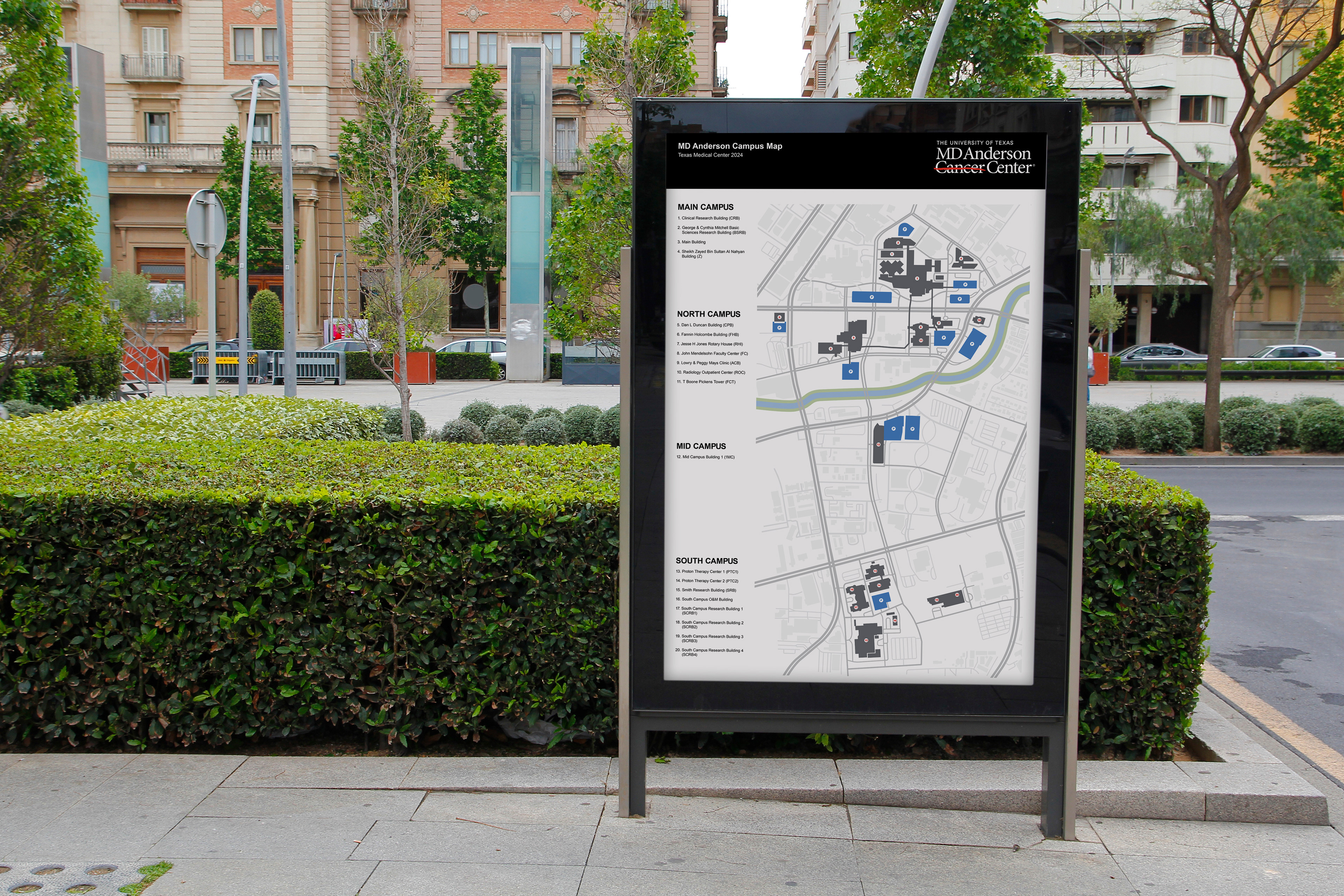
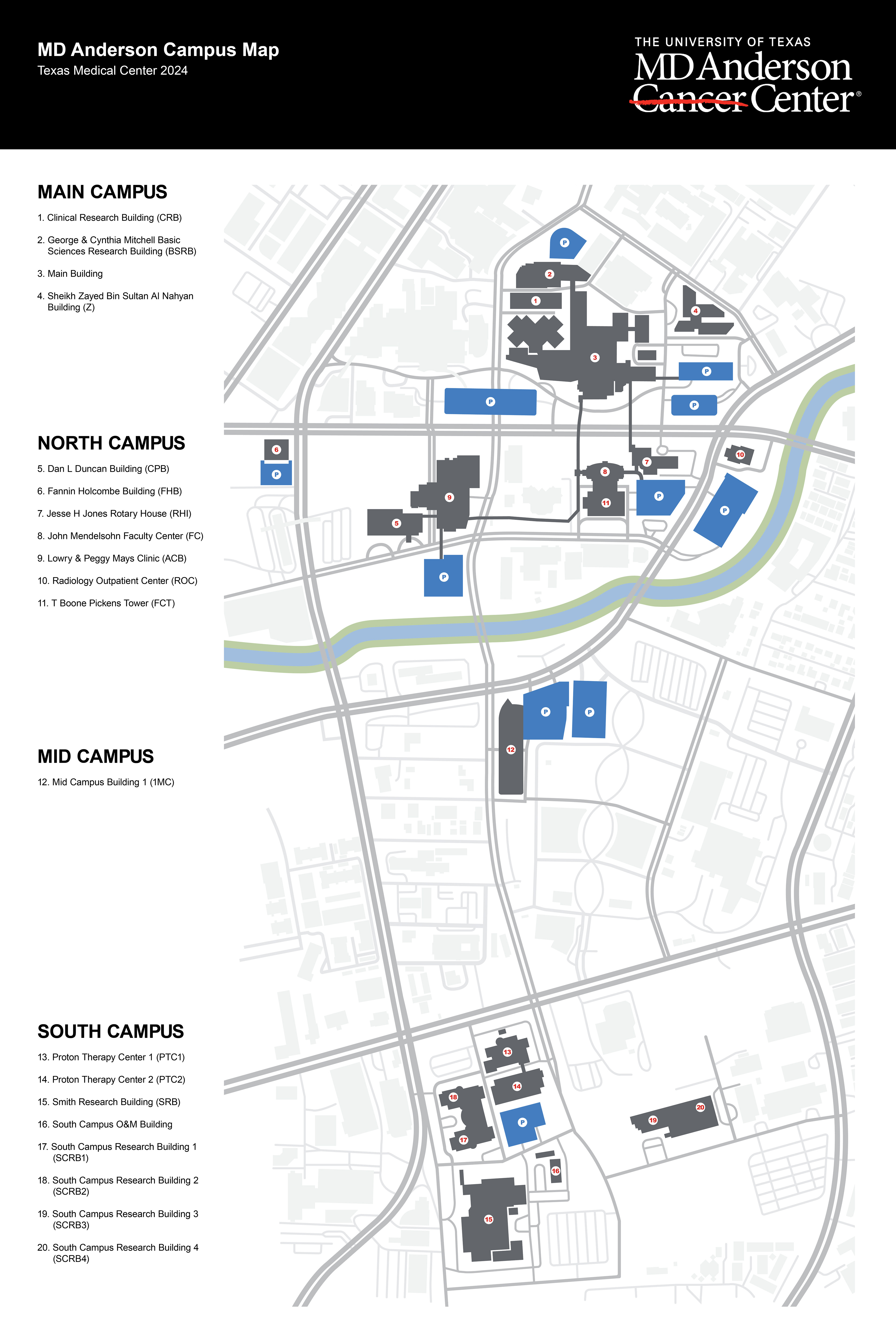
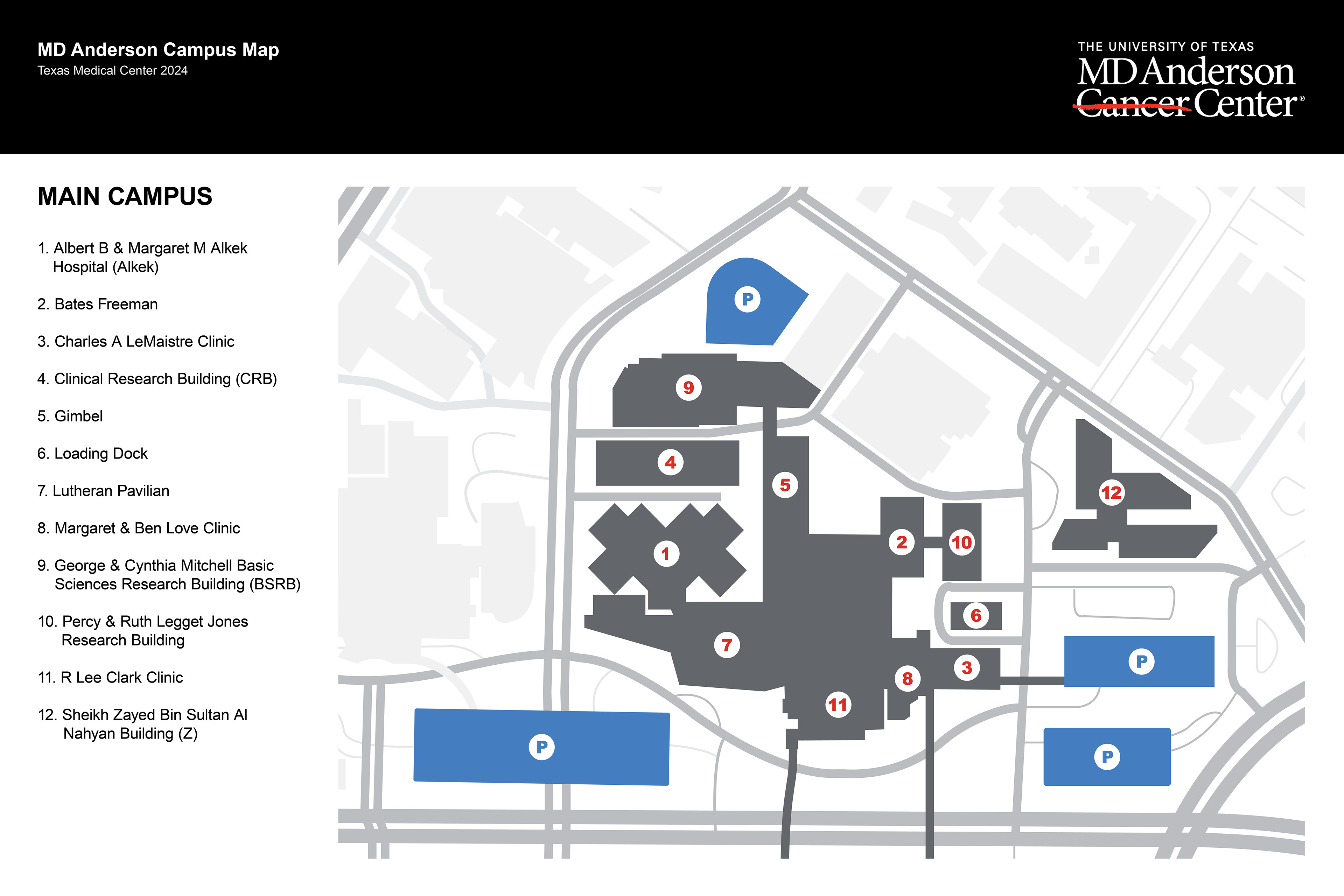
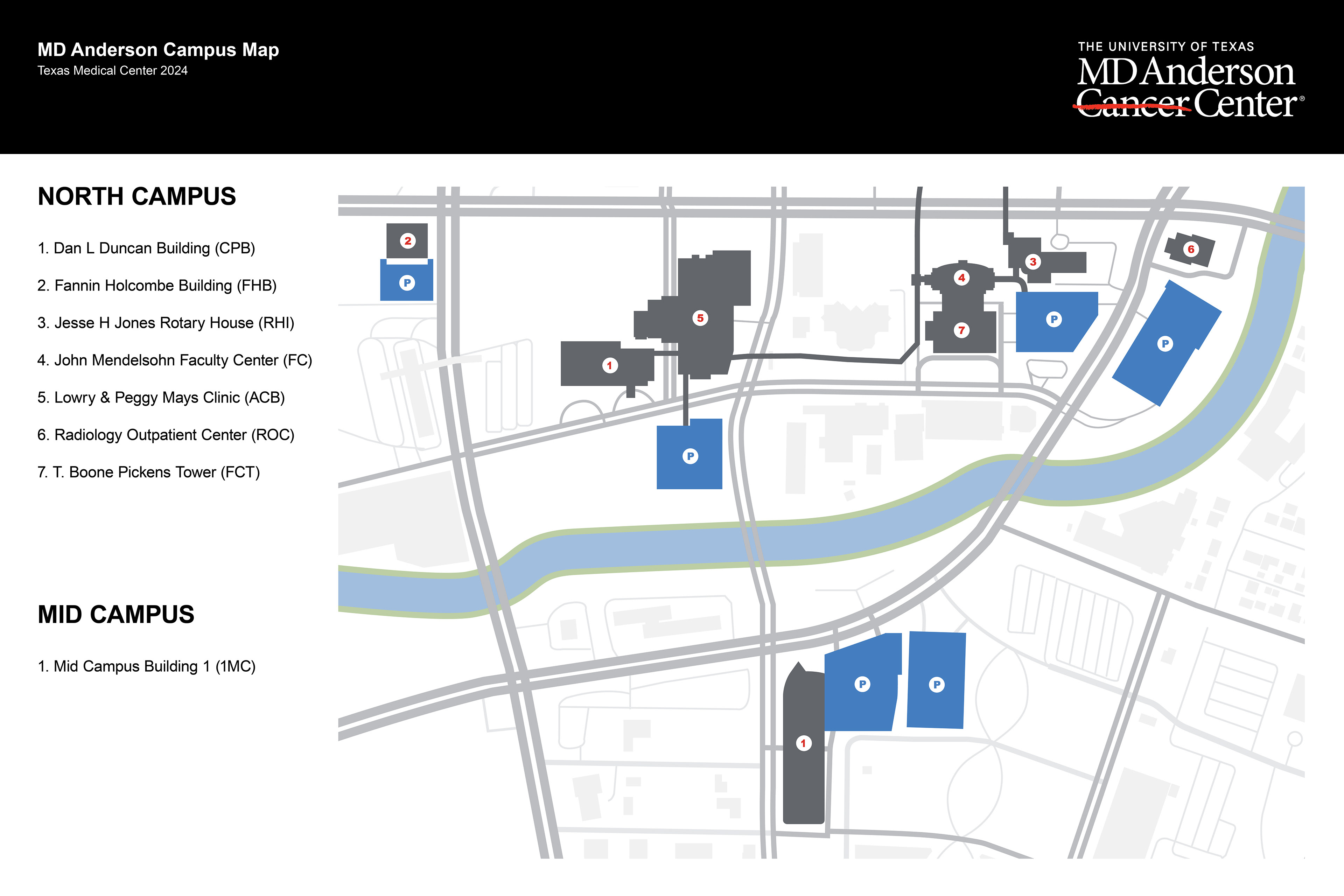
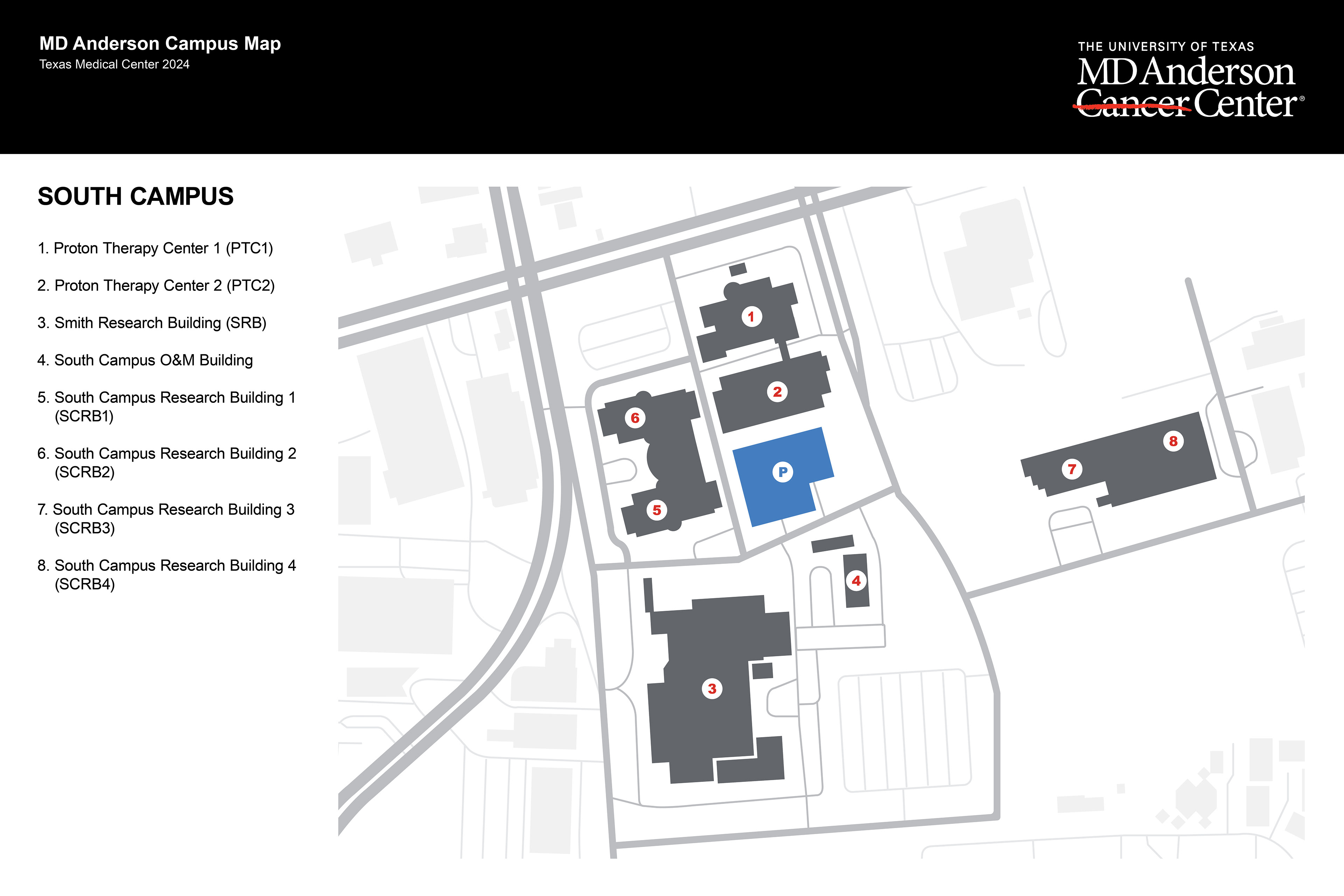
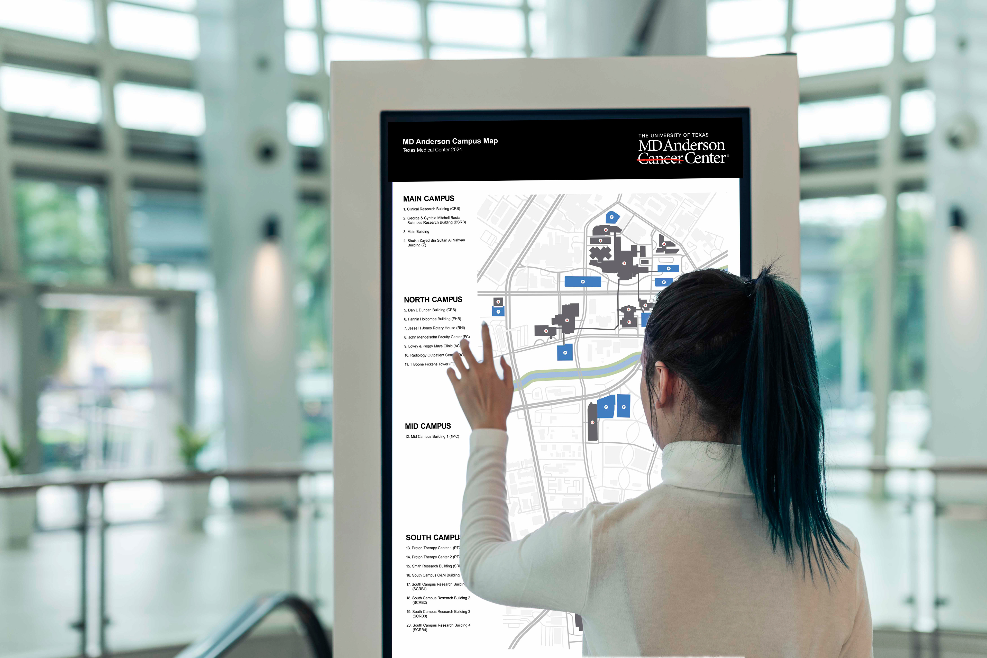
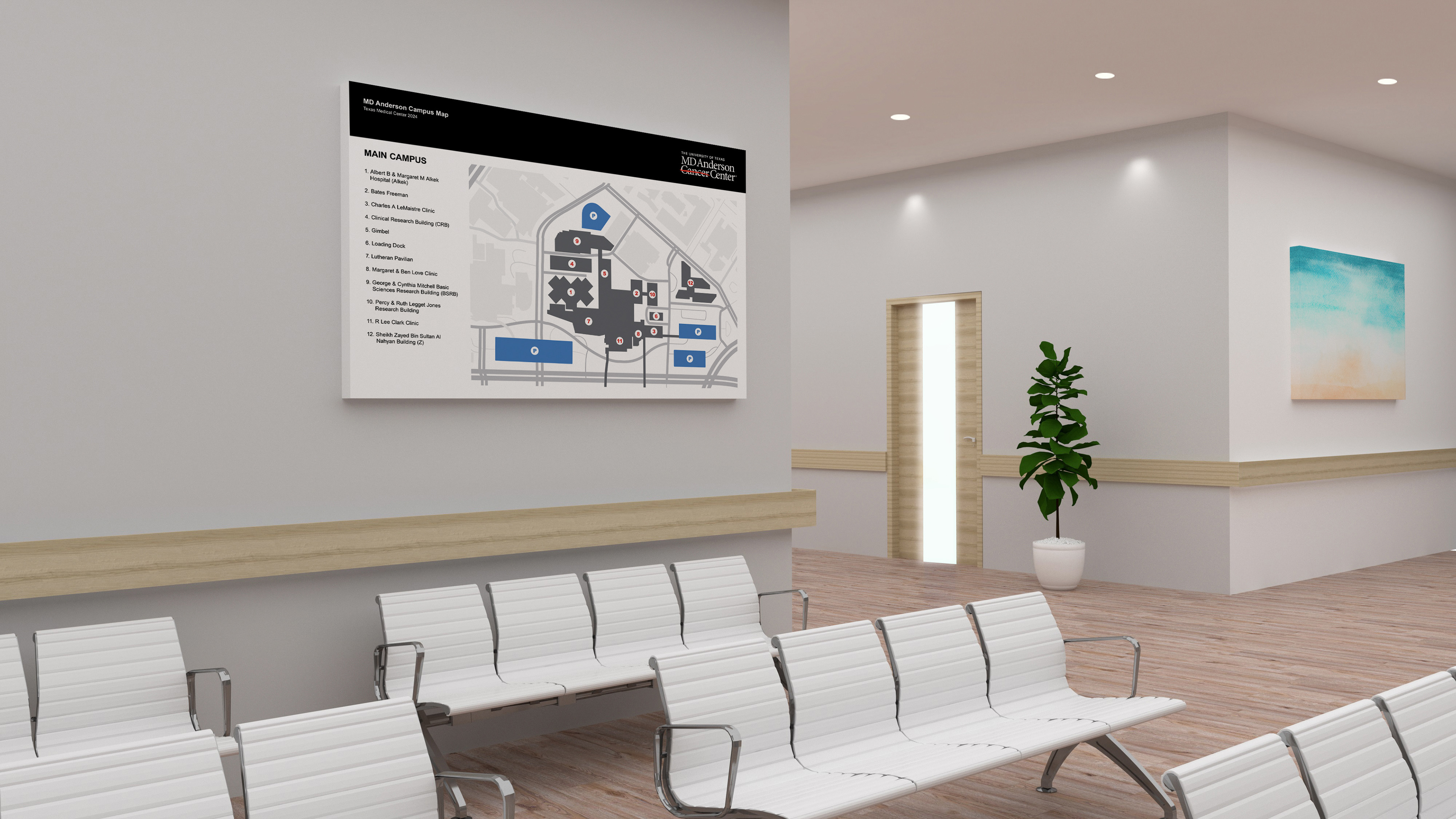
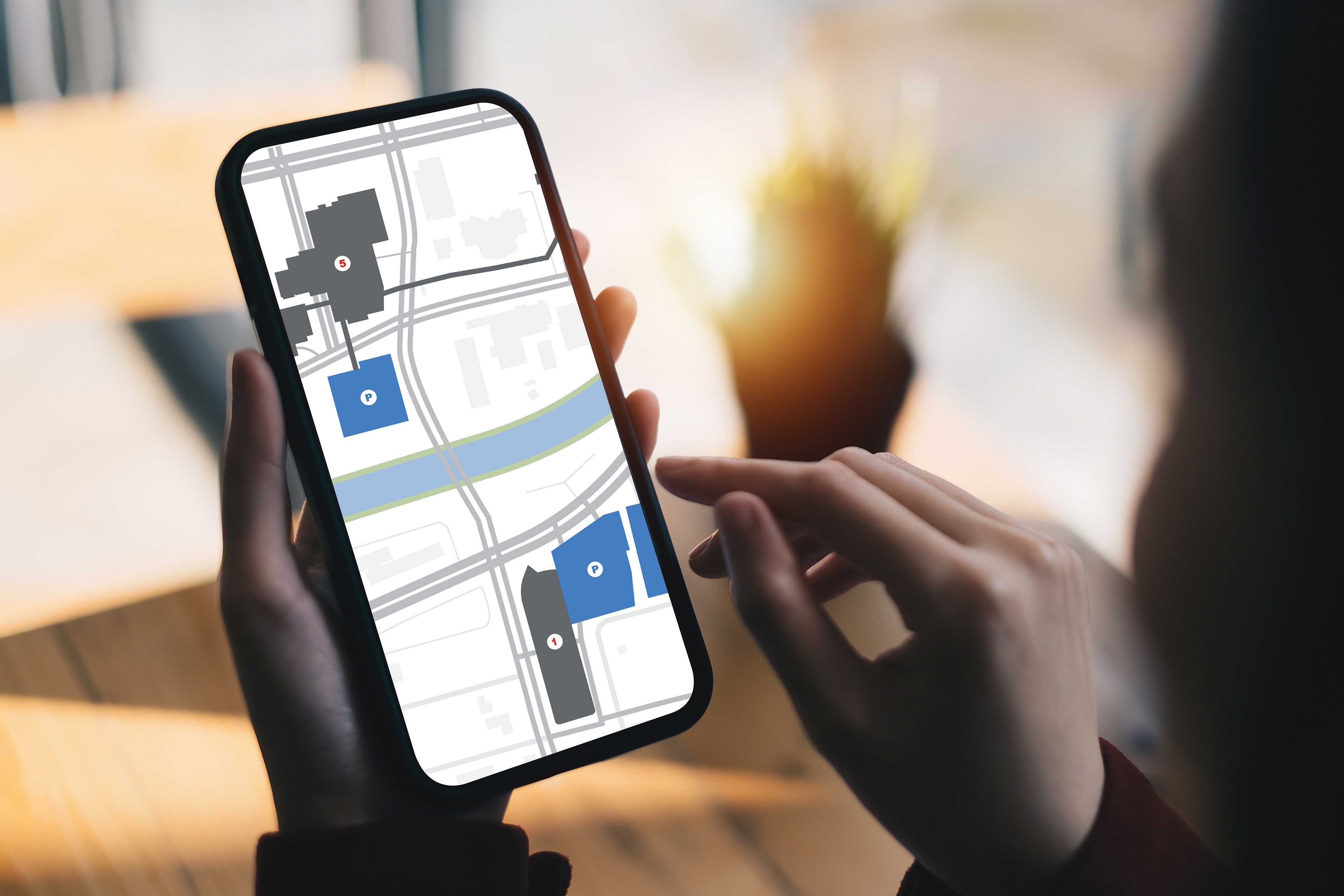
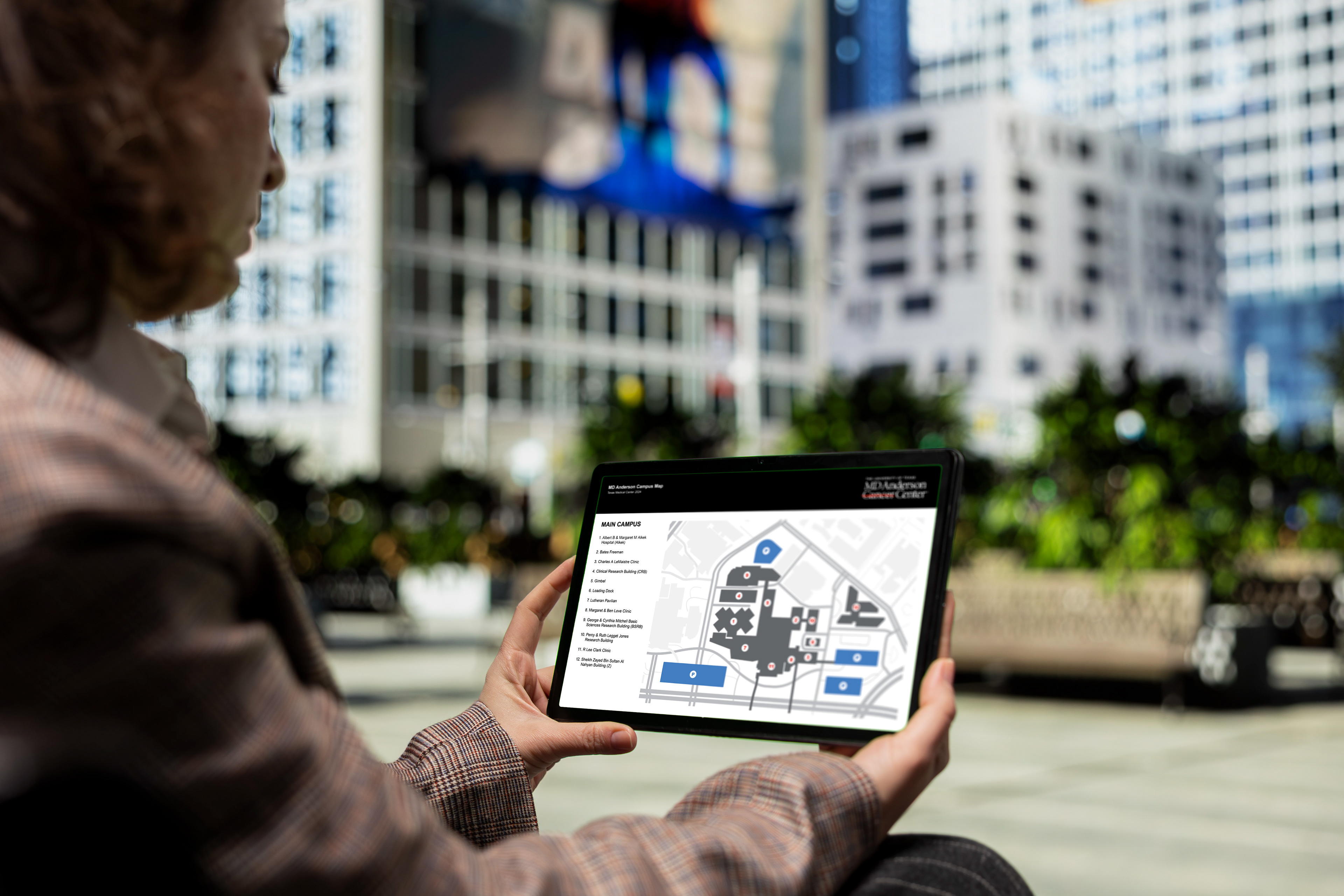
Overview: I worked on the design of a map system that made it easier to identify individual MD Anderson buildings, connect building names with their acronyms, and locate nearby parking. The final set included a full campus map along with main, north / mid, and south campus versions, giving users both a big-picture view and more focused area maps.
Delivered: Information Design, Wayfinding Design, User-Centered Design.
PROCESS
The main challenge was making a large and complicated campus feel easier to understand, especially for people who were new to the environment. Many buildings were known by acronyms that did not clearly match their names, which made navigation more confusing than it needed to be.
My role was to turn that information into a visual system that felt clear, organized, and easy to use. I focused on creating a map series with strong hierarchy, simple navigation, and enough detail to be useful without overwhelming the user. Breaking the campus into main, north / mid, and south versions also helped make the information more manageable and easier to scan depending on where someone needed to go or located.
OUTCOME
The completed map system transformed a confusing campus experience into a clearer, more user-centered wayfinding tool. By connecting building names, acronyms, and parking locations within one cohesive visual system, the design made the MD Anderson TMC campus easier to understand and navigate. The full campus map, along with the main, north / mid, and south campus versions, created a scalable solution that improved clarity, readability, and usability for users unfamiliar with the campus.
MD Anderson | www.mdanderson.org | Houston, TX
Information Design | Wayfinding Design | User-Centered Design
Let's Connect
Thank you!